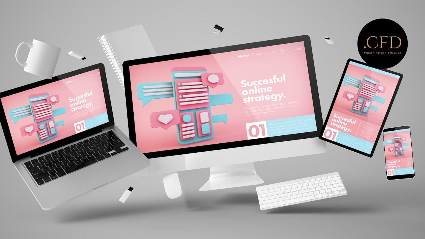
Imagine you’re scrolling through your favorite fashion brand’s website on your phone, eager to check out the latest collection. But instead of a smooth experience, you get tiny text, buttons that refuse to be clicked, and images that seem to be having a meltdown. Annoying, right? Now picture the same website on your laptop—everything works perfectly. That’s a classic example of bad website orientation.

In today’s world, more than 60% of web traffic comes from mobile devices. That’s right—more people are accessing websites on their phones than on desktops. If your website looks stunning on a computer but turns into a jumbled mess on a phone, you’re losing more than half of your potential audience. And for fashion brands, designers, or creators, that could mean losing sales, followers, and brand credibility.
What Exactly is Website Orientation?
Website orientation is about making sure your site looks and functions well, whether it’s viewed on a phone, tablet, or computer. Think of it as tailoring your website to different screen sizes. When someone visits your site on their phone, they’re typically holding it vertically (portrait mode). On a desktop or tablet, they might view it horizontally (landscape mode). A good website adjusts smoothly to these different orientations, ensuring users get a seamless experience no matter what device they’re using.
Website orientation isn’t just about aesthetics—it’s about usability. Imagine trying to click a tiny “Buy Now” button on your phone or having to pinch and zoom to read product details. That’s a recipe for frustration. A site that adjusts properly to different screens helps users find what they need quickly and enjoyably. Happy users stick around longer, and the longer they stay, the more likely they are to buy something or engage with your content.
Why Should You Care About Website Orientation?
1. Your Audience Expects It:
Let’s face it—people have zero patience for websites that don’t work well. If your site is hard to navigate on mobile, visitors will bounce within seconds. For a fashion brand or design portfolio, that means lost opportunities to showcase your work or make a sale.
2. Boosts Credibility and Trust:
A website that works flawlessly on both mobile and desktop screams professionalism. It shows that you care about your audience’s experience. Whether you’re a fashion designer, creative entrepreneur, or an influencer, a well-optimized website builds trust and credibility. And trust = more conversions and brand loyalty.
3. SEO Benefits:
Google loves mobile-friendly websites. If your website is optimized for mobile devices, it gets a boost in search rankings. Better rankings mean more visibility, more traffic, and more opportunities for your brand to grow. If your competitors’ sites are mobile-friendly and yours isn’t, guess who’s getting the top spot on Google?
4. Future-Proofing Your Brand:
The number of mobile users is only going to increase. Ensuring your website is orientation-friendly now means you’re setting yourself up for long-term success. You’ll stay ahead of the curve and keep your brand relevant as technology evolves.
How to Nail Website Orientation
So, how can you make sure your website delivers a smooth experience for both mobile and desktop users? Here are some easy-to-follow tips:
1. Use Responsive Design:
Responsive design means your website automatically adjusts to different screen sizes. Most modern website platforms and templates come with responsive design options, making it easier than ever to optimize your site.
2. Simplify Navigation:
Mobile users don’t want to tap through endless menus. Keep your navigation simple and clear. Use big buttons, drop-down menus, and make sure key information is easy to access with minimal clicks.
3. Optimize Images and Content:
Large images can slow down your site on mobile. Compress images and ensure they load quickly. Also, keep your content concise and avoid long paragraphs that are hard to read on smaller screens.
4. Test Across Devices:
Don’t assume your website works well on all devices—test it! Check your site on different phones, tablets, and computers. Switch between portrait and landscape modes to make sure everything adjusts smoothly.
5. Fast Load Times:
Speed matters. If your site takes too long to load, people will leave. Optimize your website’s speed by reducing unnecessary plugins, compressing images, and using clean code.
Give Your Brand a Boost with .cfd
If you’re in the fashion or creative world, your website needs to reflect your style and professionalism. And what better way to do that than with a .cfd domain? The .cfd extension stands for “Clothing, Fashion, and Design,” making it perfect for brands, designers, and creatives who want to stand out.
Imagine your website as “YourBrand.cfd”—clean, memorable, and instantly relevant to your audience. It tells visitors exactly what you’re about and adds a sleek, modern edge to your online presence.
Don’t let poor website orientation cost you customers and credibility. Make sure your website is seamless, stylish, and ready for any device. And while you’re at it, take your brand to the next level with a .cfd domain.
Grab your .cfd domain on Gname today and give your audience the smooth, professional experience they expect!
The world is watching—make sure they see your best side, no matter where they’re looking from.


